【Flutter/Dart】Buttonの種類と実装方法!ElevatedButtonやIconButtonの違い
この記事からわかること
- Flutter/DartでButtonの実装方法
- 種類と違い
- ElevatedButtonやIconButtonとは?
index
[open]
\ アプリをリリースしました /


環境
- Android Studio:Koala
- Xcode:16.0
- Flutter:3.29.2
- Dart:3.7.2
- Mac M1:Sonoma 14.6.1
FlutterのButton Widgetの種類
Flutterでボタン機能を実装できるButton Widgetは色々な種類が用意されています。今回はそれぞれの特徴や使い方などをまとめていきたいと思います。
- ElevatedButton・・・立体的なデザインのボタン
- TextButton・・・背景なしのシンプルなボタン
- OutlinedButton・・・枠線付きのボタン
- IconButton・・・アイコンのみのボタン
- FloatingActionButton・・・画面上に浮かぶボタン
- GestureDetector / InkWell・・・タップや長押しなどのジェスチャーを検出し、独自のカスタムボタンを作成
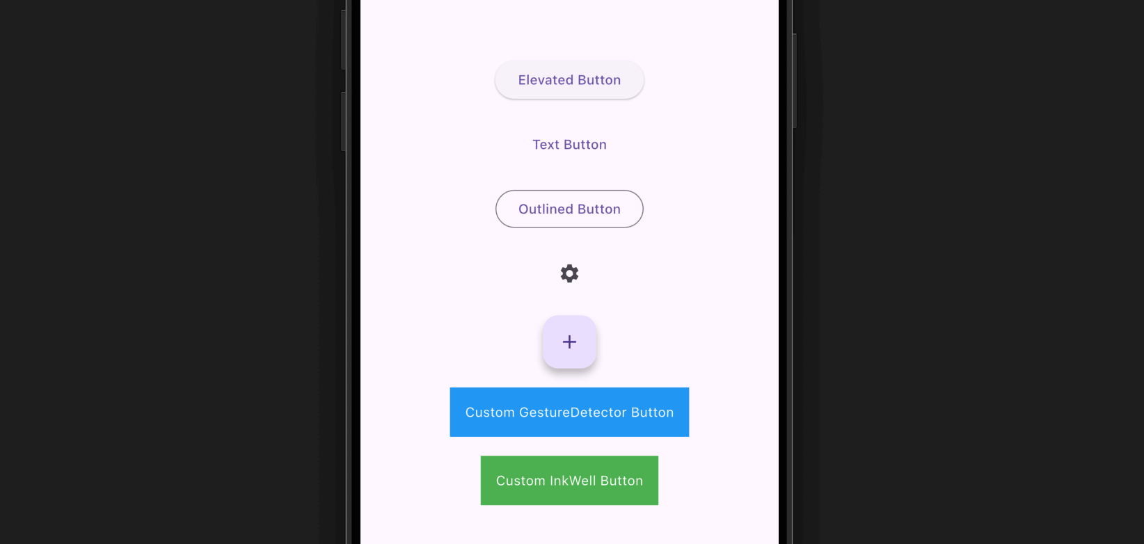
ElevatedButton
「ElevatedButton」は立体的なデザインのボタンです。周りに影がデフォルトで表示されるのでフラットな場所に設置すると視認性の高いボタンになります。記述方法はonPressedにタップ時に実行したいアクションをchildにWidgetを渡します。
childに渡すのはTextのみでも良いですが、アイコンやカスタムウィジェットも指定可能です。
スタイル(デザイン)を変更する
ボタンのスタイル(デザイン)をカスタマイズしたい場合はstyleにElevatedButton.styleFromで背景色や文字色、影の濃さ、余白、角の丸みなどを調節することが可能です。
長押し
ボタンが長押しされた場合の処理はonLongPressに渡せばOKです。
フォーカス制御
ボタンのフォーカスを制御したい場合はfocusNodeにFocusNodeインスタンスを渡します。
TextButton
「TextButton」は背景なしのシンプルなボタンです。記述方法やカスタマイズ方法はElevatedButtonと基本的に変わりません。
OutlinedButton
「OutlinedButton」は枠線付きのボタンです。記述方法やカスタマイズ方法はElevatedButtonと基本的に変わりません。
IconButton
「IconButton」はアイコンのみのシンプルなボタンです。記述方法やカスタマイズ方法はElevatedButtonと基本的に変わりませんがchildではなくiconでIconを指定します。マテリアルデザインのアイコンがIconsから色々参照できるようになっているので簡単に色々なアイコンを使用することができます。
アイコンのサイズを変えたい場合はiconSizeに値を指定します。
FloatingActionButton
「FloatingActionButton」は画面上に浮かぶボタンです。記述方法やカスタマイズ方法はIconButtonと基本的に変わりません。このボタンは画面の右下などに配置されることが多いデザインになります。
GestureDetector / InkWell
「GestureDetector」と「InkWell」はタップや長押しなどのジェスチャーを検出できるWidgetです。これを使用することでカスタムボタンを作成できますが、それ以外にも用途が色々あるWidgetになります。
| 機能 | GestureDetector | InkWell |
|---|---|---|
| タップイベント | ◯ | ◯ |
| リップルエフェクト(※) ※ ボタンが押されたようなUIエフェクト |
✕ | ◯ |
| 長押し (onLongPress) | ◯ | ◯ |
| ダブルタップ (onDoubleTap) | ◯ | ✕ |
| ドラッグ・スワイプ対応 | ◯ | ✕ |
まだまだ勉強中ですので間違っている点や至らぬ点がありましたら教えていただけると助かります。
ご覧いただきありがとうございました。